Webinar icons
Overview
Tasked with creating a set of 27 icons for an online webinar service. The icons needed to be highly legible at small sizes, work well in digital formats, and tie in with the existing webinar brand.
My contribution
Icon design
The team
Year
2015

Process
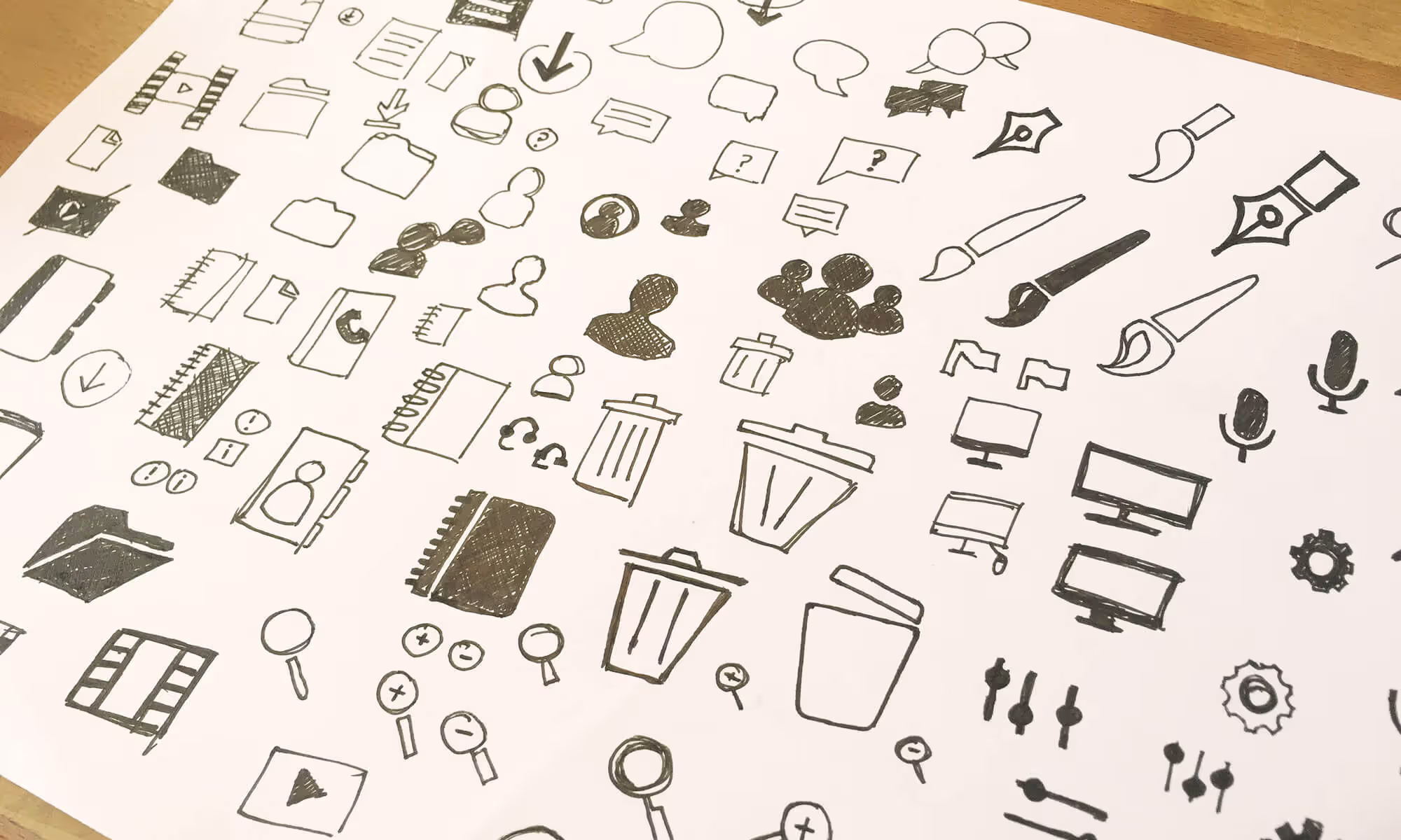
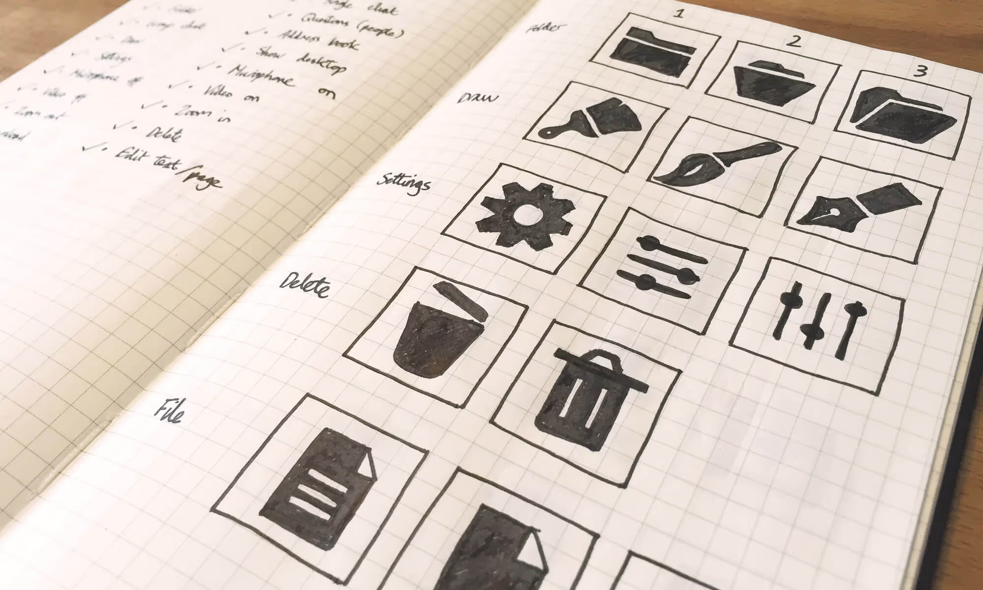
Like most icon design projects — I start with a stage of discovery. Exploring different routes for each metaphor. I sketched the icons first and then made decisions based on the meaning, legibility, and how the metaphor ties to the brand. To get approval on the stylistic approach — I worked up four metaphors in three distinct styles. The icons I looked at for each route were file, user, chat and delete. This covered a nice cross-section of the set of icons needed.
A well-defined brief meant the size of the icons had already been decided. This got rid of the deliberation of whether to start small and scale up, or start large and scale down. Each icon needed to fit inside a 26x26 pixel canvas. To streamline the design process — I designed a grid to fit different key shape sizes and help tie the icons together.


Outcome
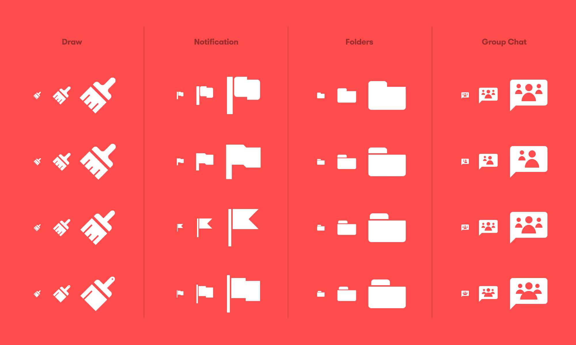
The final result is a consistent and considered set of 27 glyphs to be used in the webinar UI. The icons were implemented with SVG’s — for crisp shapes and lightweight web usage.
